London Olympic logo boosts love for Chinese seal
Updated: 2007-06-07 18:19:59
By Cruz Fang (chinadaily.com.cn)
|
|||||||||||
Beijing - Many Chinese may not like the logo for the 2008 Beijing Olympics, but after seeing the newly-unveiled jigsaw puzzle-like design for the 2012 London Games, they feel lucky having a pretty good one.
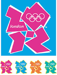 A number of Chinese don't understand how this "messy" pattern has come out from selection process, saying the so-called "China Seal" a neat blend of China's history and sport.
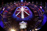
Championed by London Olympic officials but disapproved by the public, the 2012 Olympics logo has met far more opposition than that of Beijing's only days after its unveiling.
Jacques Rogge, president of the International Olympic Committee praised the design as innovative, but the logo has seen worldwide reaction going the opposite direction, triggering scathing criticism online and even people demanding for a replacement.
Meanwhile, the Chinese are pleased that at least most of them support their own culture-loaded stamp to represent the image for the nation's debut Olympic experience.
An official for the Beijing Olympics orgnizing committee who would only speak on the condition of anonymity said: "I don't like the design. It looks messy. I know it wins support from the International Olympic Committee, but I personally don't like it."
The graffiti-like design also generated the same response from 36-year-old Man Bin who works for China's State Council Information Office.
"It's quite unorganized and looks bad,." Man said. "I don't see beauty from it, and it reminds me of the run down streets of New York City."
To 28-year-old Zhang Xin, a video game music producer, the London logo is too "avant-garde". "I don't really like it because it's too electronic looking," Zhang said. "It looks like it was designed by the French or Americans."
These three interviewees firmly supported Beijing's design.
"Beijing's logo displays a sense of history and culture," said Zhang. "The running figure is quite an original idea and really shows what it means."
When asked for opinion on the London Olympics design, 22-year-old American Erin Zureick, who works in Beijing as intern, cannot wait to express her dislike. "Do you think it's ugly too?" was her response. "It's too bright. It just isn't very appealing to look at it."
But Zureick is in favor of the "China Seal", describing it as "modern" and represents some part of Chinese culture. And all in all, "it's really nice-looking", Erin added.
Both Zureick and Zhang appreciate the idea embraced by the London Games organizers of attracting young people. "But it seems like it was a good idea that went in the wrong direction," the American university student said.
Zhou Kun, a 28-year-old telecommunication engineer doesn't know she's in the minority as she is one of the few who is fond of London's logo.
"It's fantastic," Zhou exclaimed when seeing the hot pink sign. "I like the color. When you look at it for the first time, it gives you a brand new sense, a kind of expectation."


Medal Count |
||||
| 1 | 46 | 29 | 29 | |
| 2 | 38 | 27 | 22 | |
| 3 | 29 | 17 | 19 | |
| 4 | 24 | 25 | 33 | |
| 5 | 13 | 8 | 7 | |
| 6 | 11 | 19 | 14 | |


Most Viewed

Gold medal moments
Age not a problem for Olympic dreams
Olympic moments to remember
Beijing Olympics just keeps on giving
Against the Olympic spirit
Olympic fashion tips
Taking success overseas
Competition Schedule